Hello there! I’m Dan, a frontend engineer at Qonversion. I’m working on a no-code paywall builder that will allow you create effective paywalls without writing any code. Sounds intriguing, right? Through my journey with paywalls and subscription models, I've gained a solid understanding of what drives conversions and how to create paywalls that encourage users to subscribe, rather than simply blocking content.
This experience has given me the confidence to share best practices and strategies to help you optimize your paywall design. Whether you’re a developer, product manager, or designer, grasping the essentials of paywall UI/UX design is key to creating a seamless user experience that converts. By the end of reading, you’ll have actionable insights to craft paywalls that look appealing and convert way better. Let’s dive in!
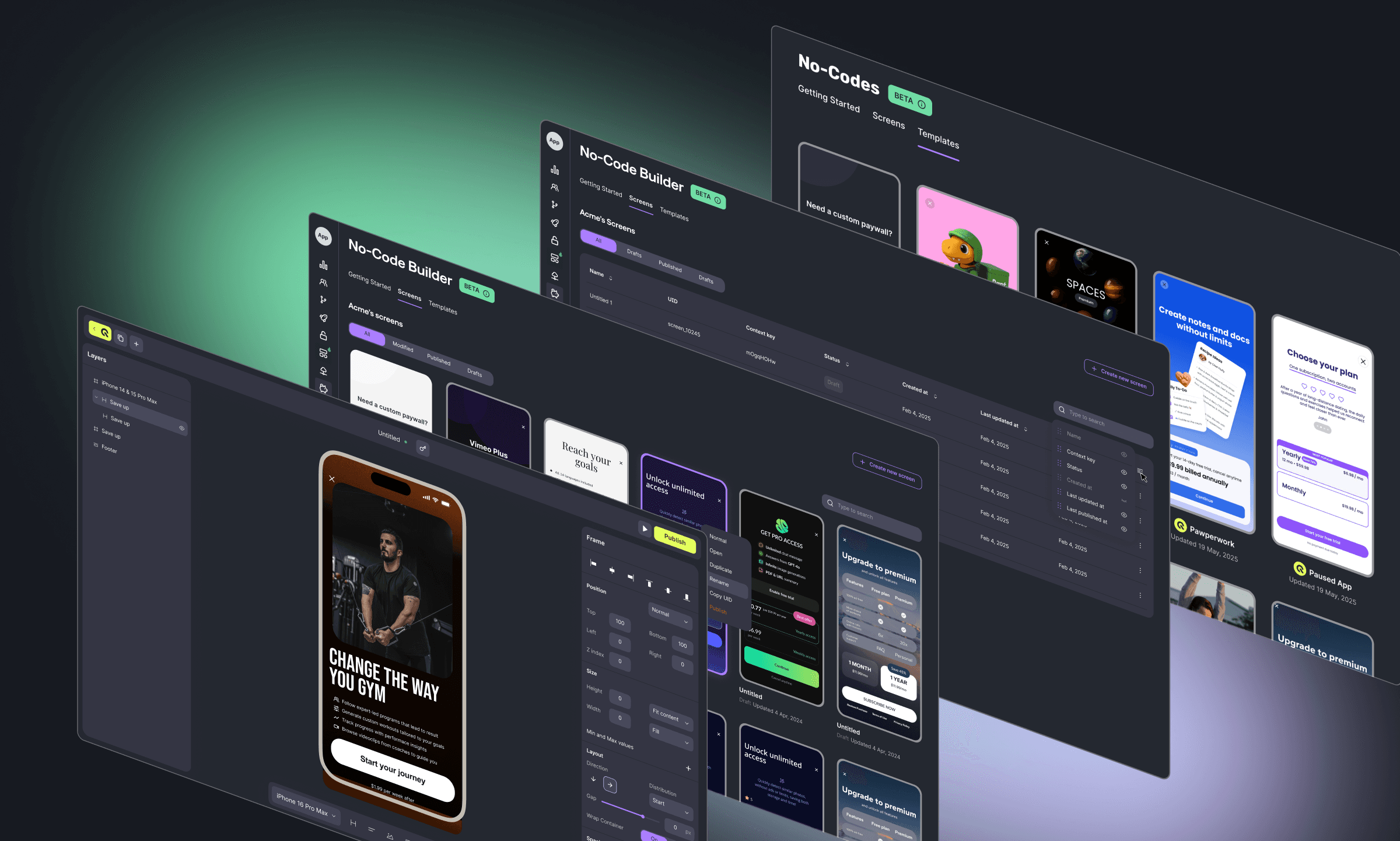
App Paywall: What is it?
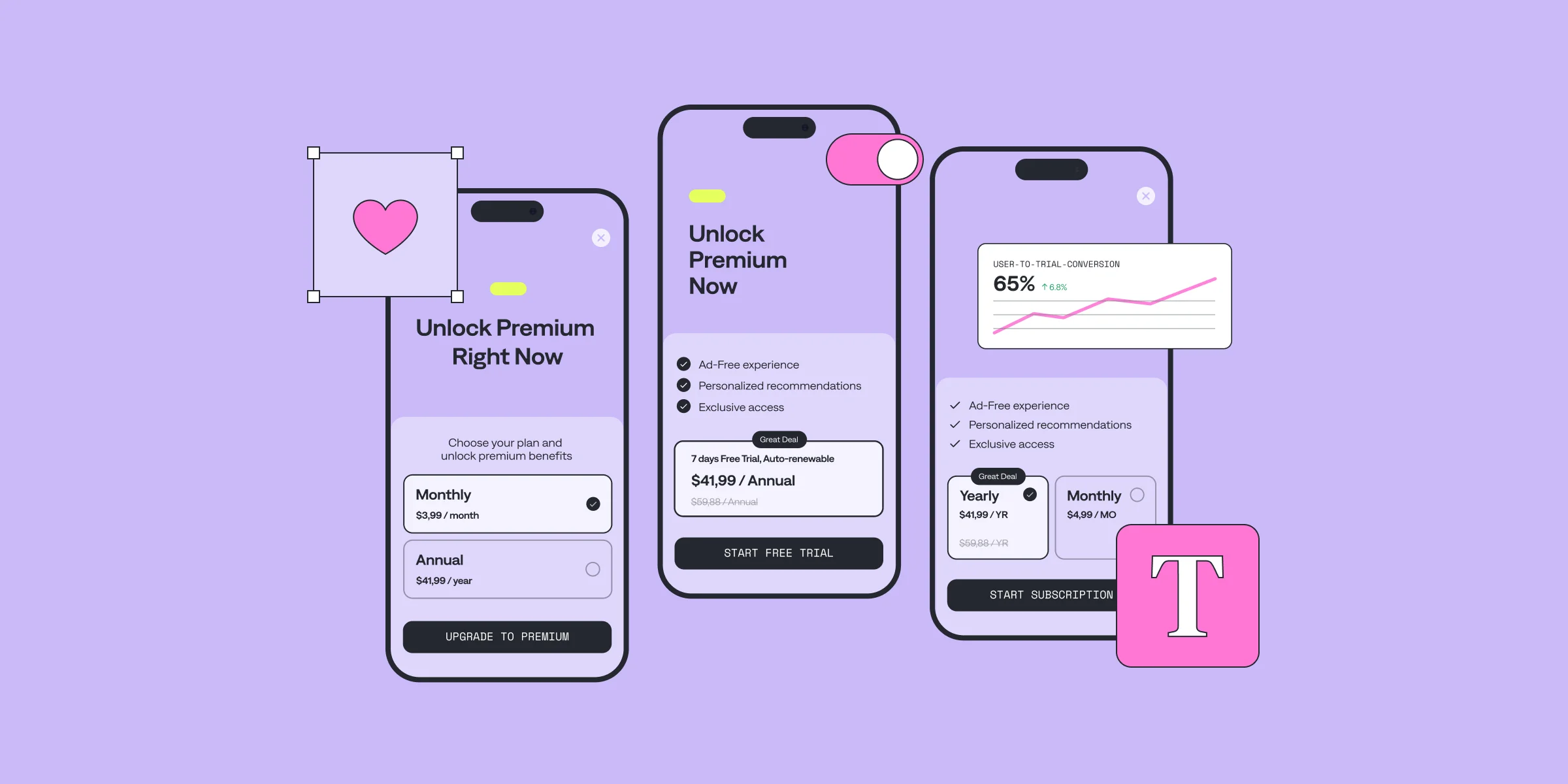
Paywalls restrict access to certain content or features, requiring users to subscribe or pay to unlock them. They are central to monetizing apps, especially within the subscription economy. The subscription strategy is common in apps that rely on recurring revenue models, such as streaming services, fitness apps, news platforms, and productivity tools.The objective of a paywall is not just to block access but to highlight the value of subscribing. An effective paywall design addresses users’ fears, uncertainties, and doubts with effectively designed paywall elements. Tip: With a Qonversion's No-Code Builder 2.0, you can easily create, customize, and launch high-converting paywalls without writing code — so your team can focus on optimizing offers, copy, visuals, and pricing to match your audience.А well-designed paywall UI decides if the user will pay or abandon your app altogether. For developers and product managers, implementing an effective paywall design is key to driving revenue while keeping users engaged.
Hard vs. Soft Paywalls: What’s the Difference?
There are two main types of paywalls: hard and soft.
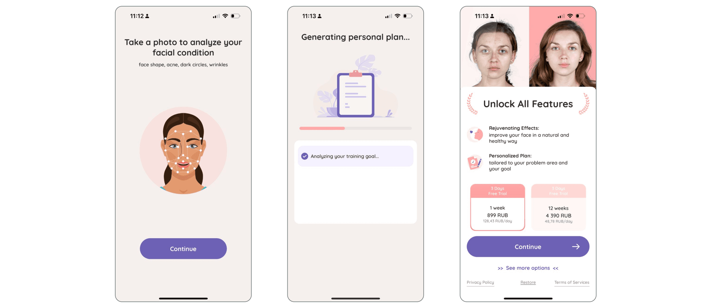
Hard Paywalls completely block access to content or features until the user subscribes or pays. They are often used by apps offering high-value content, like premium video streaming services or specialized productivity tools. While hard paywalls can lead to higher conversion rates, they may also cause user drop-offs if the value isn’t immediately clear.
A clear example is FaceYogi, which asks users to answer a few questions and upload a photo for a face analysis. It then shows a personalized plan in progress but immediately locks it behind a hard paywall — leveraging the user’s time investment to boost the chance of subscribing.
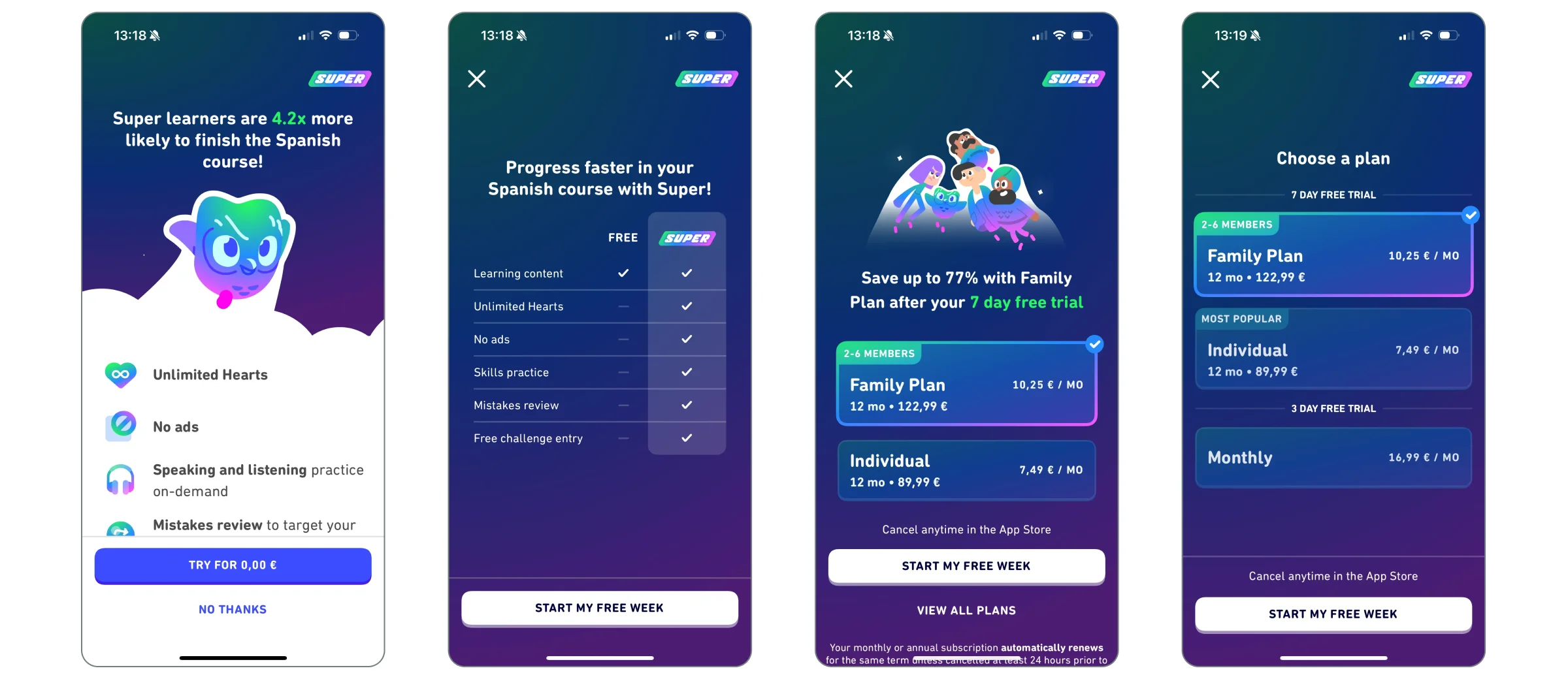
Soft Paywalls allow users to access a limited amount of content or features for free before prompting them to subscribe. This freemium model is common in news or learning apps, like Duolingo. Soft paywalls help build trust by letting users experience the app’s value before committing to a purchase.
The choice between a hard or soft paywall depends on your app’s business model, target audience, and the type of content or service you offer. Both have pros and cons, but success lies in how you present the paywall to users.
Paywall Design is Critical for App Growth
Designing a successful paywall involves creating a smooth, intuitive, and persuasive experience that encourages subscriptions. A well-executed UI/UX design can significantly boost conversion rates, while a poorly designed paywall can frustrate users and lead to abandonment.
A successful paywall should integrate seamlessly into the user journey, feeling like a natural part of the app experience. This involves balancing clear communication, trust, and timing with an appealing design that highlights the value of subscribing.
Your paywall design needs to be transparent, easy to navigate, and aligned with your app’s overall user experience. If users feel confused, misled, or pressured, they’re more likely to leave. Conversely, if the paywall is introduced at the right time with a compelling value proposition, users are more likely to convert.
Next, we’ll explore the key UI/UX principles to achieve this balance.
Key UI/UX Principles for Effective Paywall Design
Clarity and Simplicity
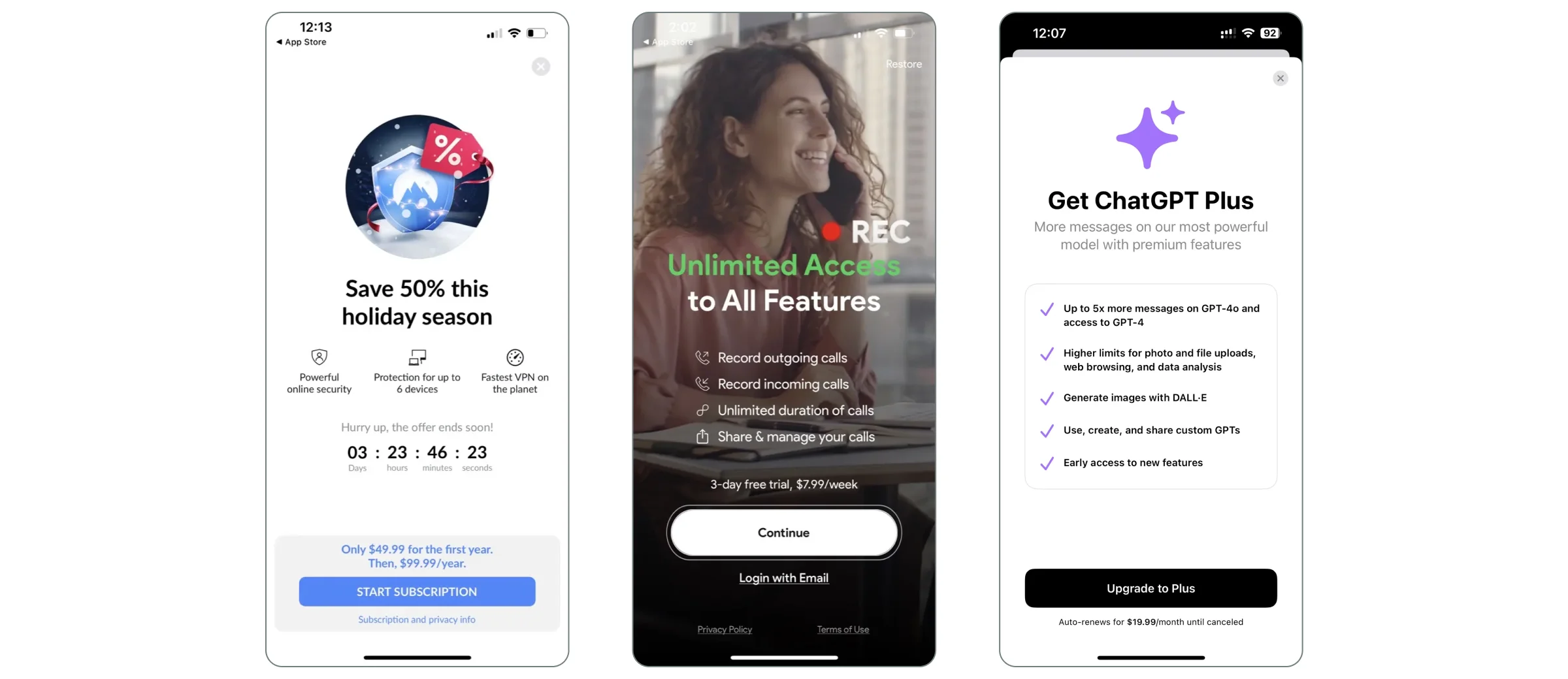
Clarity is crucial in paywall design. Users should instantly understand what they're being asked to do and why. A cluttered paywall can lead to frustration and abandonment.Simplicity is the foundation of clarity. Present essential information in a clean, easy-to-read format. Avoid overwhelming users with too much text or too many options. Focus on delivering a straightforward message that communicates the value of subscribing.
How to achieve clarity and simplicity in your paywall design?
- Keep messaging concise: Use short, impactful sentences to explain the benefits. Avoid jargon.
- Limit distractions: The paywall should focus on encouraging the user to subscribe. Minimize unnecessary elements.
- Use clear CTAs: Prominent, easy-to-understand calls to action like “Start Free Trial” or “Unlock Premium” are effective.
Here are paywall examples hat demonstrate clearity and simplicity.
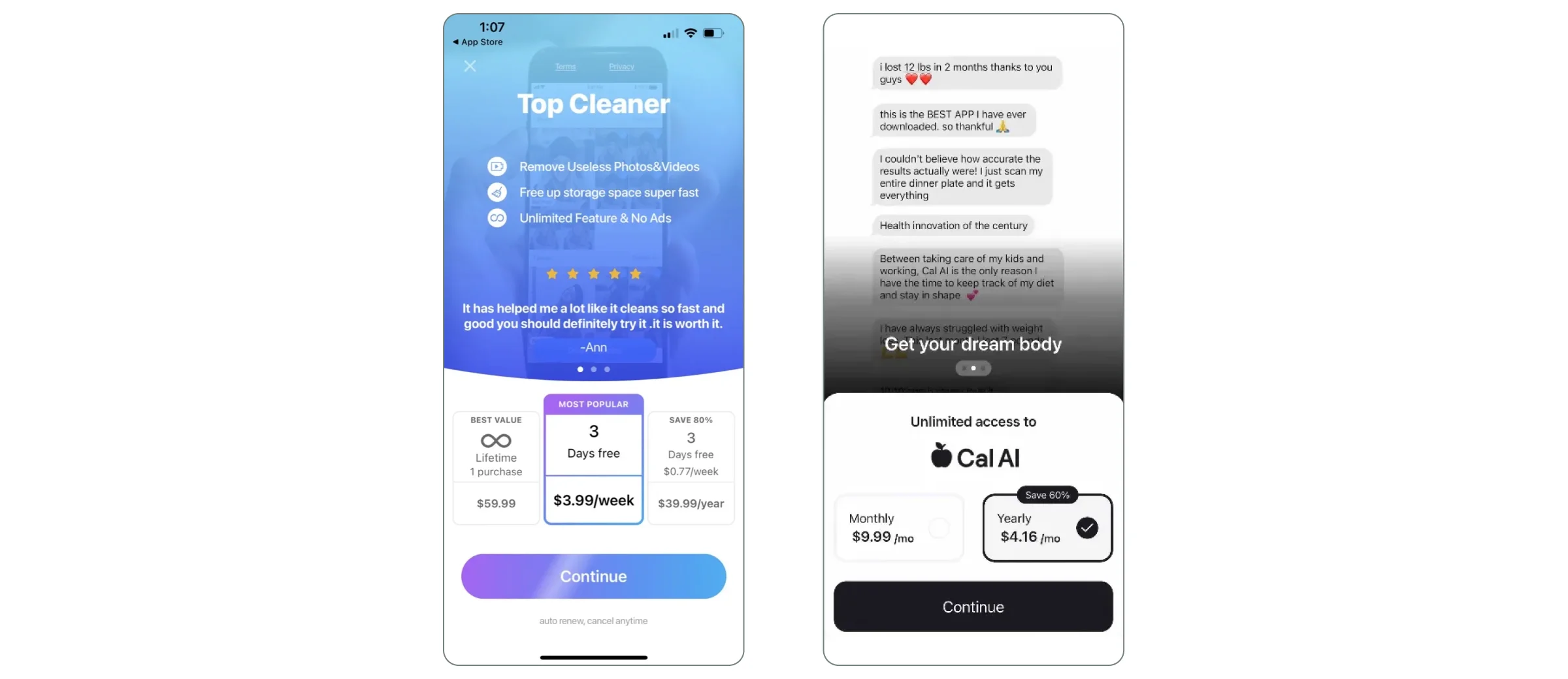
2. Highlighting Value Proposition
Once you’ve achieved clarity and simplicity, the next critical element is communicating the value proposition. Users need to understand not just what they’re paying for, but why it’s worth their money. This is where you highlight the unique benefits of subscribing and how it enhances their experience with your app.A strong value proposition answers the question: “What’s in it for me?” It should clearly convey how the premium features or content will solve a problem, save time, enhance enjoyment, or provide exclusive access.
How to highlight value proposition in your paywall design?
- Showcase key benefits upfront: Don’t bury the most compelling features. Make sure users can quickly see the top benefits of subscribing, such as “Ad-Free Experience,” “Exclusive Content,” or “Unlimited Access.”
- Use visual cues: Icons, badges, or short feature lists can help users quickly grasp the benefits without needing to read long paragraphs. Visuals also make the paywall more engaging.
- Focus on user needs: Tailor your value proposition to your audience. If your app is a fitness app, for example, emphasize how subscribing will help users achieve their fitness goals faster or more effectively.
- Leverage social proof: If applicable, include testimonials, user reviews, or statistics like “Join 1 million+ subscribers” to build trust.
The goal is to make the value proposition so compelling that users feel the subscription is a natural next step to enhance their experience with your app. These apps did a great job highlighting the value proposition on their paywalls.
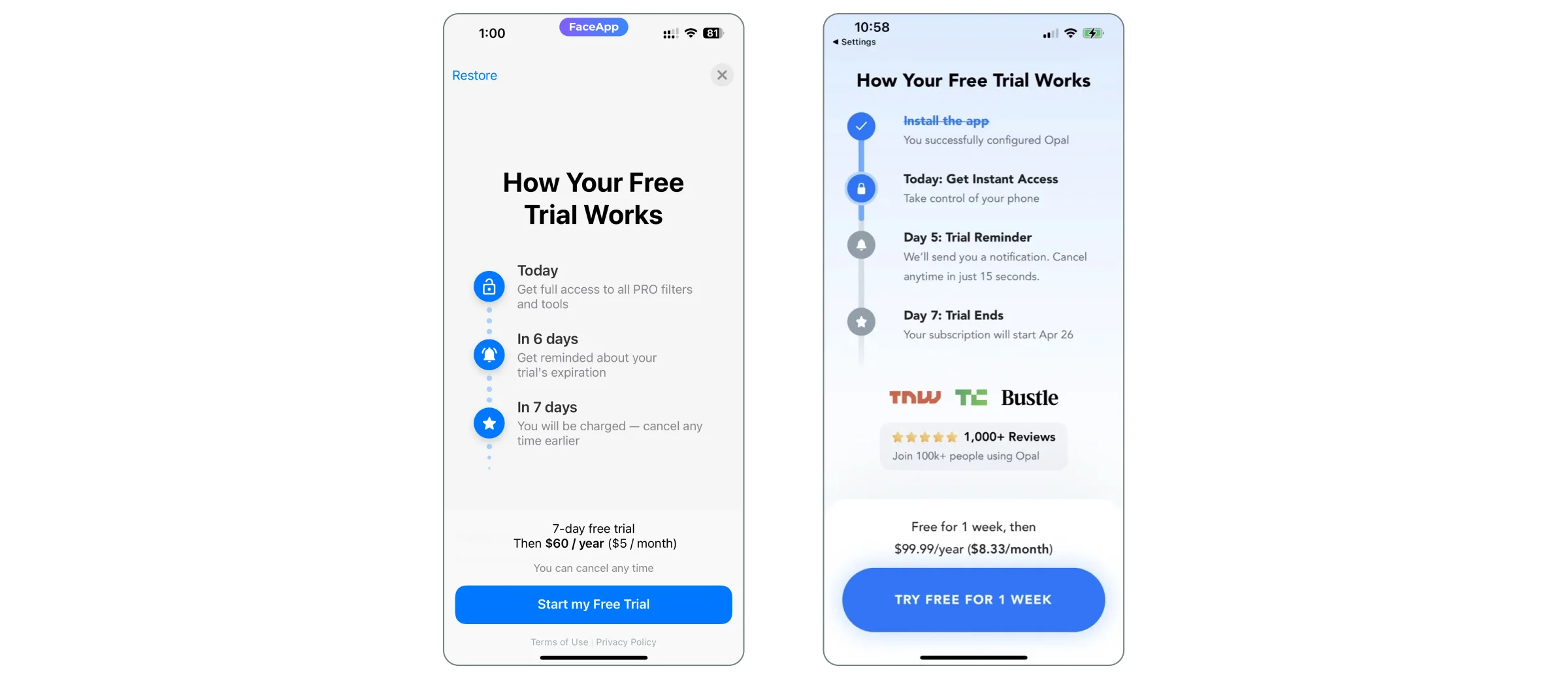
3. Transparency in Pricing and Terms
So, you’ve nailed down the value proposition. What’s next? Transparency. Even with a sleek design, users might still hesitate. Why? Because of those pesky fears, uncertainties, and doubts — FUD, as we call them. Ever worried about hidden fees or unclear cancellation policies? You’re not alone. These concerns can stop users in their tracks.
Think about it: users need to know exactly what they’re signing up for. Pricing, billing cycles, terms — lay it all out clearly. Hidden fees and surprise charges? These are trust killers.
When pricing is transparent, it builds trust and eases decision-making. Users are far more likely to hit that subscribe button when they’re confident about the financial commitment.
How to display transparency in pricing and terms on your paywall design?
- Clearly display the price: Ensure that the price of the subscription is prominently displayed and easy to find. Avoid burying the price in small text or behind multiple steps.
- Mention the billing cycle: Be explicit about whether the subscription is billed monthly, annually, or on any other recurring basis. If it's a free trial, clearly state when the user will be charged and how much.
- Explain cancellation policies: Users should know how and when they can cancel the subscription. If there are any conditions or restrictions, communicate them upfront to avoid surprises.
- Avoid hidden fees: Make sure there are no unexpected charges. If there are additional costs (e.g., in-app purchases or tiered pricing), make this clear from the start.
- Reassure with clear cancellation policies: Make it easy for users to cancel their subscription at any time. Highlight this option prominently on the paywall to alleviate fears of being locked into a long-term commitment.
- Provide trial transparency: If offering a free trial, ensure users know exactly when the trial ends and when they will be charged. Send reminders before the trial period expires to avoid any surprises.
- Offer a money-back guarantee: If possible, offer a money-back guarantee for users who are unsatisfied with the service. This reduces the perceived risk and encourages users to give the subscription a try.
When users feel secure and in control, they are more likely to convert. Look at these paywall examples of how FaceApp and Opal apps handled transparancy on their paywalls.
4. Timing and Placement of the Paywall
The timing and placement of the paywall in the user journey are critical to its success. If shown too early, users may not yet see the value of subscribing. If shown too late, you may miss the optimal moment when the user is most engaged. The key is to place the paywall at a point where the user has already experienced enough value from the app but still has more to gain from subscribing.
Best Practices for Timing and Placement
- Trigger the paywall after key actions: Show the paywall after users have experienced a core feature of the app or reached a usage limit. For example, in a content app, this could be after reading a few free articles. In a fitness app, it could be after completing a workout.
- Don’t interrupt the user flow: Avoid showing the paywall in the middle of an important task. Instead, place it at natural breakpoints in the user journey, such as after completing an action or at the end of a session.
- Use progressive paywalls: Gradually introduce the paywall by first offering a free trial or limited access. This allows users to experience the app’s value before committing to a subscription.
5. Visual Hierarchy to Guide Users
A well-designed visual hierarchy helps users navigate the paywall and focus on the most important elements — primarily the call to action (CTA). By prioritizing certain elements through size, color, and positioning, you can guide users toward the desired action without overwhelming them.
How to keep visual hierarchy on a paywall:
- Prioritize the CTA: The CTA button should be the most prominent element on the paywall. Use contrasting colors and bold fonts to make it stand out. Ensure that it’s placed in a position where it’s easily visible without scrolling.
- Use typography effectively: Use larger fonts for key messages like the subscription benefits or pricing, and smaller fonts for secondary information such as terms and conditions.
- Create a logical flow: Arrange content in a way that naturally leads users from the value proposition to the pricing and finally to the CTA. Avoid placing too much information between the key benefits and the CTA, as this can create friction.
- Limit distractions: Remove any unnecessary elements that could divert attention away from the CTA. This includes excessive images, animations, or secondary links that aren’t related to the subscription.
6. Offering Subscription Tiers
Offering too many subscription options can overwhelm users, leading to decision paralysis. On the other hand, providing too few options might not meet the diverse needs of your audience. The key is to strike a balance by offering 1–2 subscription tiers that cater to different user preferences without causing confusion.
Best Practices for Subscription Tiers:
- Limit to 1–2 tiers: Offering a basic and a premium plan is often enough to cover different user needs without overwhelming them. Too many options can lead to indecision.
- Clearly differentiate the tiers: Highlight the key differences between the tiers, such as feature access, content availability, or pricing. Make it clear what users are getting with each option.
- Highlight the best value: If one tier offers significantly better value (e.g., a yearly plan with a discount), make sure to emphasize this with badges or labels like “Best Value” or “Most Popular.”
Why it matters: Simplifying the subscription choices helps users make a decision faster, reducing friction and increasing the likelihood of conversion.
7. Flexible Subscription Periods
Different users have different preferences when it comes to payment frequency. Offering flexible subscription periods (e.g., weekly, monthly, yearly) allows users to choose a plan that best fits their budget and commitment level. Here;s Grammarly and FaceTune apps with clear and structured paywall designs that offer flexible subscription periods.
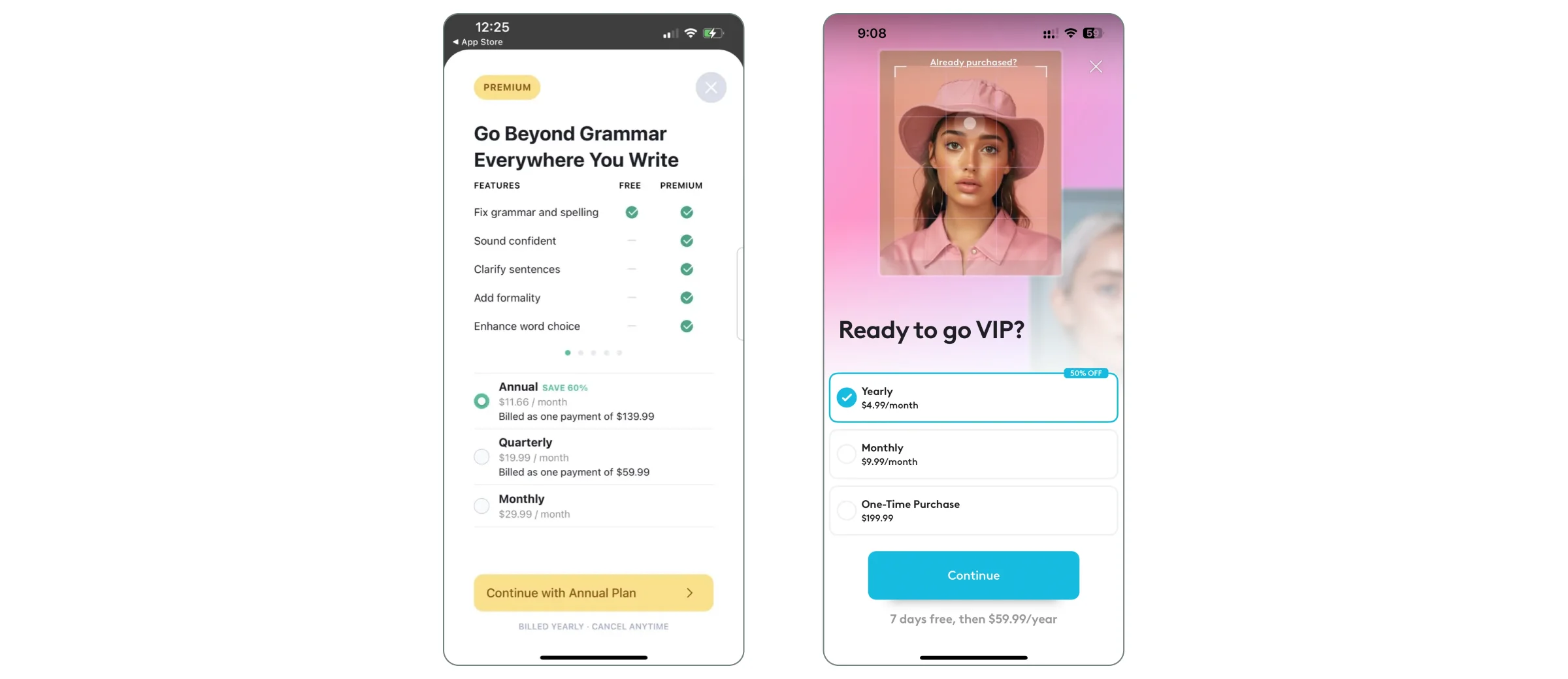
How to come up with flexible subscription periods?
- Offer multiple payment intervals: Provide options for weekly, monthly, and yearly subscriptions. This caters to users who may prefer short-term commitments as well as those looking for long-term savings.
- Highlight savings for longer commitments: If offering a yearly plan, clearly show how much users will save compared to the monthly option. For example, “Save 20% with an annual plan.”
Use clear labels: Make it easy for users to understand the differences between the payment intervals. Use labels like “Billed Monthly” or “Billed Annually” to avoid confusion.
8. Pricing and Introductory Offers
Introductory offers, such as free trials or discounts, can be a powerful way to entice users to subscribe. These offers reduce the perceived risk and give users a chance to experience the full value of the app before committing to a paid subscription. What to do?
- Offer a free trial: A free trial allows users to explore the premium features without any upfront commitment. Make sure the trial period is long enough for users to experience the app’s value.
- Use discounts effectively: Limited-time discounts (e.g., “Get 50% off your first month”) can create a sense of urgency and encourage users to subscribe sooner.
Highlight the offer clearly: Make sure the introductory offer is prominently displayed on the paywall. Use bold fonts, contrasting colors, or badges to draw attention to the offer.
9. Paywall Texting: Focus on User Benefits
The language used on the paywall should focus on how the subscription will benefit the user, rather than simply listing features. Users are more likely to subscribe when they understand how the premium features will improve their experience. How to achieve this?
- Highlight benefits, not just features: Instead of saying “Access premium content,” say “Unlock exclusive articles that help you stay ahead in your industry.”
Use concise, impactful language: Keep the messaging short and to the point. Users should be able to understand the benefits of subscribing within seconds.
10. Social Proof
Social proof helps build trust by showing that others have already benefited from the subscription. This can be especially important for new users who are unsure about whether the subscription is worth it.
How to integrate social proof in a paywall design?
- Use testimonials or reviews: Include quotes from satisfied users or expert endorsements to build credibility.
- Show subscriber numbers: If applicable, display the number of current subscribers (e.g., “Join 50,000+ happy users”) to show that others trust your product.
- Highlight awards or recognitions: If your app has received any awards or recognitions, include these as additional trust signals.
11. Localized Pricing
Offering region-specific pricing can help make your subscription more accessible to users around the world. This not only improves the user experience but can also increase conversion rates in regions where the standard pricing may be too high.
How to localize pricing?
- Display price to local currency: Displaying prices in the user’s local currency is a best practice to reduce cognitive load. Users are more likely to trust and understand the cost when it’s presented in a familiar currency. This also helps avoid confusion or hesitation caused by exchange rates or unfamiliar pricing formats. Qonversion helps developers automatically localize pricing for different regions, ensuring users see the relevant price in their local currency, which can significantly reduce friction.
- Adjust pricing for local markets: Consider offering different prices based on the purchasing power in different regions. For example, a subscription that’s affordable in the US might be too expensive in other countries.
- Use localized offers: Tailor discounts or promotions to specific regions to make the subscription more appealing to users in those areas.
Designing for Different Platforms: iOS and Android Paywall Considerations
When designing paywalls, it's important to tailor them to the specific guidelines and user expectations of each platform. Both iOS and Android have their own sets of rules and best practices that developers need to follow to ensure compliance and create a seamless user experience.
iOS Paywall Design
For iOS, Apple has strict guidelines regarding in-app purchases and iOS paywall design. Here are a few key considerations:
- Adhere Apple’s Guidelines: Ensure your paywall complies with Apple’s App Store Review Guidelines, especially regarding in-app purchases for digital goods and services, to avoid rejection.
- Declutter the Paywall: Apple values simplicity. A clean design with a clear call to action (CTA), concise messaging, and a strong focus on the value proposition can enhance user understanding and conversions.
- Use Apple’s Native UI Elements: Leverage Apple’s native design components to create a seamless experience. Elements like the purchase confirmation screen should feel familiar to iOS users, creating a sense of trust and security.
Android Paywall Design
For Android, while there is more design flexibility, developers must still adhere to Google Play’s policies. Consider the following:
- Comply with Google Play’s Policies: Ensure your app integrates seamlessly with Google Play Billing, as Google requires its billing system for digital goods and services.
- Align with Platform-Specific Norms: Android users expect different navigational patterns and UI elements. Follow Android’s Material Design principles, which focus on minimalism, bold colors, and clear typography.
- Leverage Customization: Use Android’s flexibility for layouts, animations, and interactions to create an engaging paywall experience. However, ensure it remains intuitive and easy to navigate.
Tools and Templates to Optimize Paywall Design
Qonversion simplifies paywall design and optimization with its robust No-Code Builder and A/B Testing Experiments.
No-Code Builder 2.0
Qonversion’s No-Code Builder 2.0 is a flexible, full-featured way to create and launch paywalls, onboarding and promos effortlessly without writing any code. This tool is perfect for teams that want to quickly iterate on design and test different variations without relying on developers. You can easily adjust design elements, messaging, and pricing options to fit your app’s unique branding.
A/B Testing for Paywall Design
Ever wondered which paywall tweaks can skyrocket your conversions? A/B testing is your best friend here. By trying out different versions — like layout, pricing, or call-to-action wording — you can see what works best. Maybe you’ve already thought about timing, placement, subscription tiers, or social proof. A/B testing helps you figure out which resonates most with your audience.
For instance, you could test:
- Dynamic vs. Static Paywalls: Does a paywall that adapts based on user behavior (like after reading three articles) outperform one that shows up at a set time?
- Content-Specific Offers: Tailor subscription packages based on the content users love. Finance buffs might see different offers than lifestyle enthusiasts.
- Interactive Elements: Could adding sliders for subscription duration or progress bars for unlocking a free trial boost engagement?
These creative experiments can reveal deep insights into user interactions with your paywall. Check out these exaples and ideas for niche A/B testing:
- Paywall A/B Tests for Magazine & Newspaper Apps
- Paywall A/B Tests for Fitness Apps
- Paywall A/B Tests for Music Apps
- Paywall A/B Tests for Meditation and Health Apps
- Paywall A/B Test for Apps in Productivity Category
- Paywall A/B Tests for Education Apps
Summing up Paywall Design
The future of paywall design is exciting yet challenging. Staying ahead of trends and continuously optimizing paywalls will be key. By focusing on personalization, seamless integration, and innovative pricing, you can create paywalls that not only boost subscriptions but also enrich the user journey.
Remember, the best paywalls are those that feel like a natural part of the experience. Keep testing, keep improving, and if you need any help or a consultation, contact us!

Dan
Frontend Engineer at Qonversion
Dan builds the user-facing experiences at Qonversion.