Paywall screen is the key and most important element in the subscription conversion funnel. On the paywall screen, you have the best opportunity to address all the fears, uncertainties and doubts which people have while thinking about subscribing to your app.
We’ve teamed up with Jakub Chour to put the light on all the important paywall screen elements one by one and uncover how big a role they play in a successful conversion.
Permission to play (minimal requirements)
There are rules for paywall screens (iOS | Android). You probably know them, so we won’t go into details. You can still get easily disapproved if someone from Apple just does not like your purchase page enough. It can happen after your first or 10th submission. If you are experimenting with your paywall, always have a backup page strictly by the rules.BTW, there was a slight change in Apple’s requirements last year, you don’t have to have that long legal paragraph anymore, so you can declutter your paywall a bit. See Apple’s mockups. The other minor changes coming from the latest WWDC (mostly non-paywall related) are summarized here.
Subscription Value Proposition
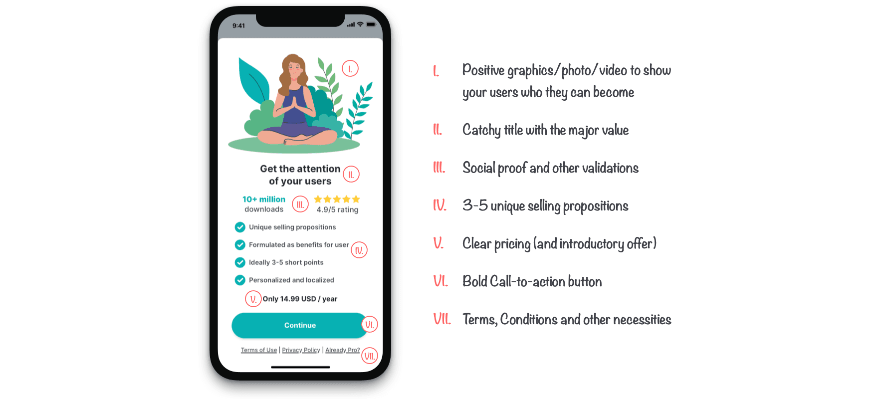
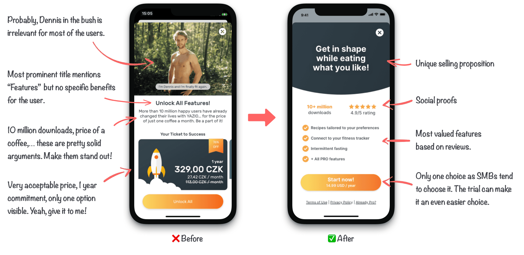
There is no one-fits-all solution you can use. If you are offering a subscription (and you probably should), think about the value you’re providing to your user. How long does your user stick with you? Is it short-term? Charge as soon as possible. Is it long-term? Offer longer trials and prioritize 3 months+ subscriptions. You can read about different offering approaches in Jakub’s article.Considering the single purpose nature of most of the mobile apps, 1–2 subscription plans are enough for most of them. With a higher amount of options, your users might suffer from decision paralysis caused by Hick-Hyman’s law.
According to our research, approximately 50% of top-grossing apps offer only 1 subscription tier, 30% offer 2 and only 20% offer 3 or more plans.
- More subscription plans can help you reach a wider audience of users. Customers that are happy with the baseline subscription plan might eventually upgrade to a higher plan.
- Tiers can help you to reach the segment of people who are willing to pay for the best (like businesses or just rich users), regardless of the price. Not a huge segment, but very valuable.
- Design the lower tier around the most popular features to reach most of the customers.
- In the higher tier, include more power-user and advanced features to justify their higher price.
Weekly vs. Monthly vs. Yearly Plans
In the past years, it became standard to offer at least 2 subscription periods: monthly and yearly plans.
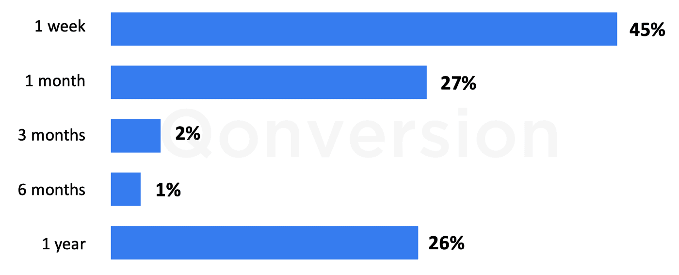
However, the Qonversion benchmark shows that the most grossing subscription period is weekly. It might be heavily driven by “scammy apps” relying on people forgetting to cancel the subscription before it renews.
- A monthly or weekly plan is a good entry point for people who’re not sure how well they’ll benefit from your app. For pricier apps, it’s crucial for acquiring new customers.
- A yearly plan secure you upfront, improve your cash flow, and reduce churn. You’ll have more time to engage with your customer, explain all features and during the year, perhaps even introducing some new features which your customers were craving for.
- Make longer periods price tempting. Industrial standard is having each subscription 2–6x higher than the previous period (e.g.: 14.99 monthly | 29.99 Quarterly | 69.99 Yearly)
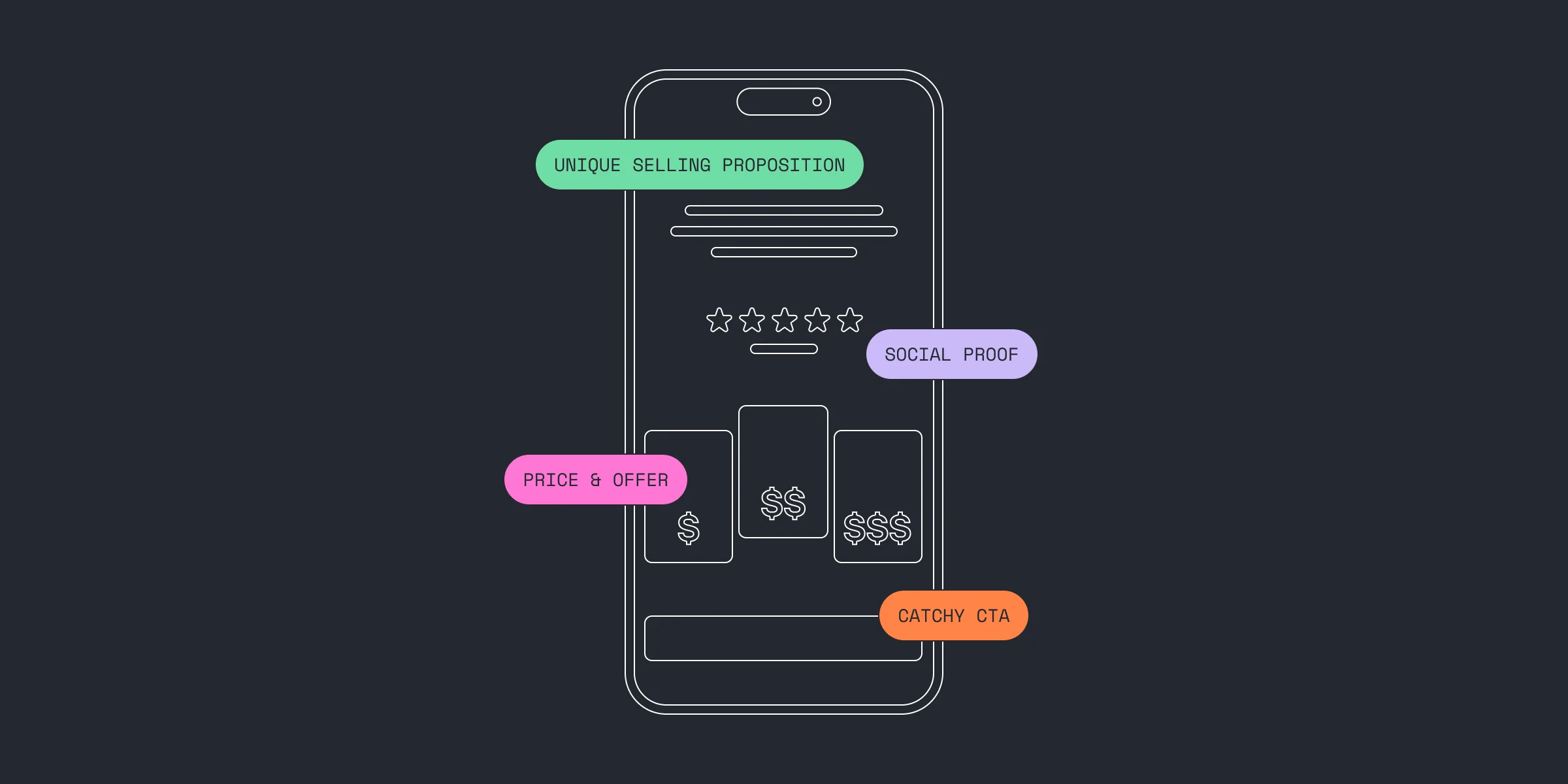
Pricing & Introductory Offers
Consider using an introductory offer. Based on your app’s nature, you can implement either a Free Trial period or Discount on the first weeks/months of usage.
- A Free Trial is a no-brainer for users and if you don’t have any additional costs with incoming users, you got nothing to lose. 90% subscription based apps provide a free-trial period for their customers.
- Pay as you go/Pay Up Front are in general a great option for apps which needs more time to demonstrate the value or they have regular monthly costs connected to a subscriber. They might also attract price sensitive customers.
- Once the user finishes an introductory period, they are no longer eligible for introductory pricing. Always check user eligibility before showing any introductory offer.
- Stick with charm pricing. Your base price in USD/EUR should be 4.99, 9.99, 14.99 or 19.99 — from my pricing experiments, it seems that users have a similar willingness to pay when paying 13.99 or 14.99. (US/EU markets)
- If your product fits in a luxury category, use the round numbers in your pricing. For other apps it’s better to use the left digit effect to optimize your sales. It turns out that subscription prices with 99 at the end increase consumer purchases by 8–10% [X]
Paywall Messaging
Does your grannie understand the benefits of your app from your paywall? As everywhere, you only got a few seconds to show your value.
- Don’t push your features, push user’s benefits — you are not selling to pros, most of your audience will be first-time users. They don’t care how much content you have or how your premium is named (very often, the most visible part of the paywall screen is something like “Go Premium”). They care about what they can get. In a few sentences.
- Use emotions — nothing sells better than imagination. You can appeal to the user’s rational decision-making by saying that your fitness program has 10-years of scientific research behind it or you can say that 3-months sub is the price for your old jeans to fit you again. Or $15 for meeting someone new.
- Sell your ASO keyword research — use words people are searching for in the app stores to increase relevance. If your top keyword by far is “Daily Journal” and *“Mood Tracker”, *make sure you use it at least once, somewhere visible.
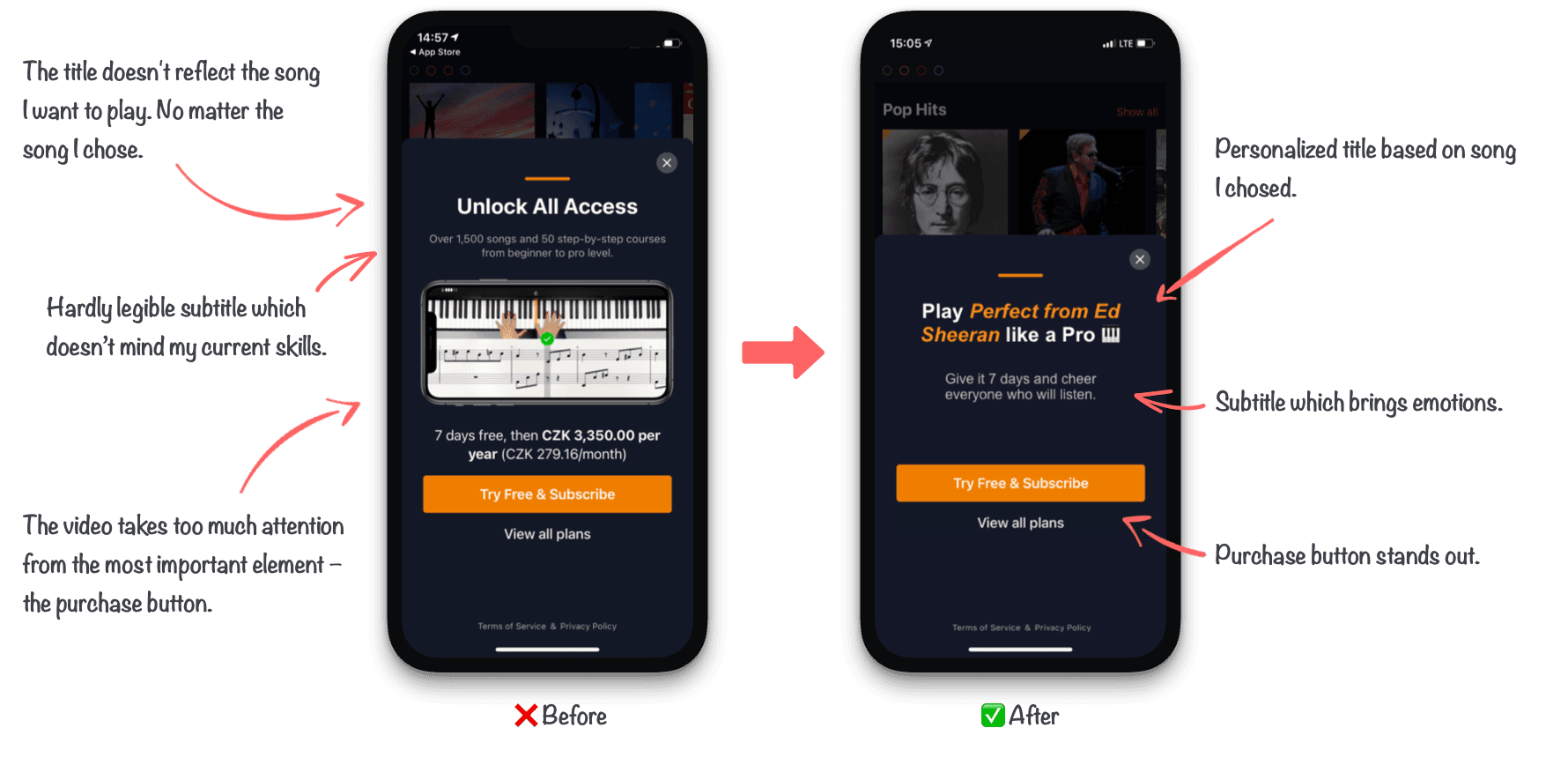
- Use information you already know — while your app stays the same, your offering can vary based on what users will state during onboarding or what led them on the premium screen. You can then change your subtitle, background image or anything else if you know they want to play medium-difficulty songs on the piano, lose 3kg or sleep better…
- Have a clear button CTA — You can try to be more creative than “Continue”, but on the other hand, the biggest lure is usually coming from the trial (Try for FREE), so you don’t need to reinvent a wheel here. We haven’t seen any huge uplifts when experimenting with the button/CTA itself.
- Be brief — only a certain portion of your users likes to read and think about what you have to offer. Don’t clutter your paywall with too much text. Think one user benefit = one sentence.
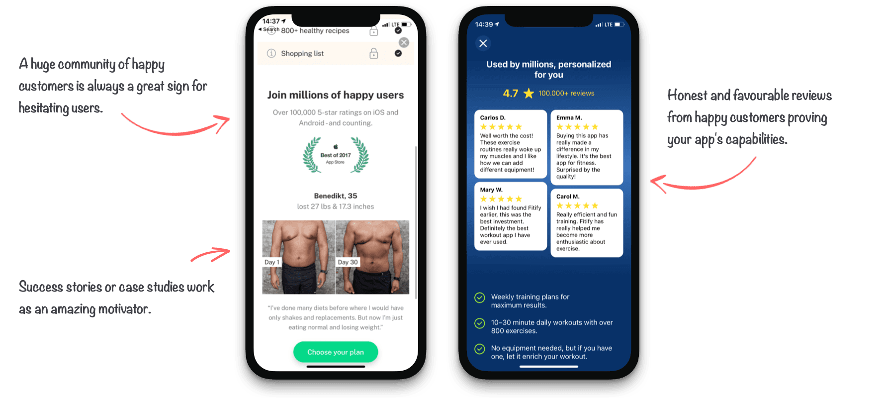
Social Proof
People tend to do what others are doing. By providing a social proof on your paywall screen, you’re adding an extra validation that they’re not alone in subscribing to your app which supports credibility and trust. Up to 92% people claim they read online reviews and 80% of them trust reviews as much as personal recommendations.
Social proof might be provided in many various ways. You can mention how many happy customers your app has or even use their genuine reviews and success stories which might also motivate your customers.
Incentives
Incentives provide additional arguments for purchase and effectively fight the friction which users are facing while considering subscribing to your app. Here are some examples of popular incentives:
- Price Based — The strongest motivation factors [x]. You can play with your price creatively using various seasonal or special discounts, 1+1 offers, bundling offers, something extra for free, etc.
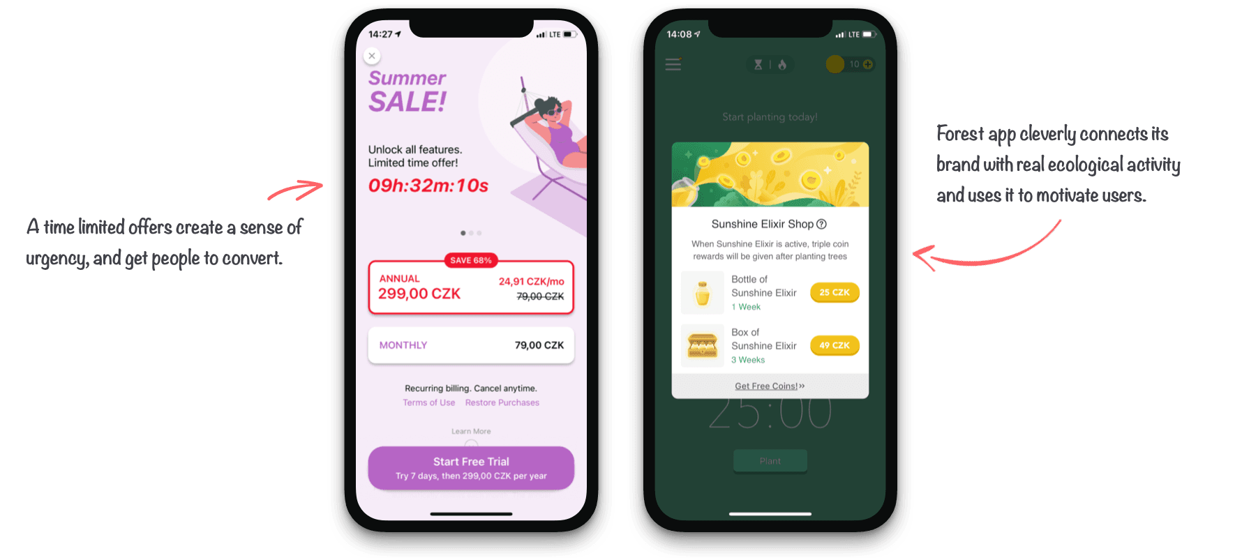
- Scarcity — People value objects that are scarce. Indicate scarcity to speed up people’s decision making. E.g.: How many people are seeing the offer now, limit the number of discounted products etc.
- Urgency — Similarly the time urgency creates a trigger to purchase. People don’t want to miss the great deal and when there’s only 1 hour left, it’s better to act now then postpone the purchase for later never.
- Moral Incentives — Show your care for the local community, ecology, world poverty or other charitable areas. Your focus area should be ideally tied to your business and of course, you should actually do what you say.
Transparency
Even though half of our life happens online, most of us still look at online payments cautiously or with concerns about being scammed. The transparency helps eliminate those potential fears and positively impacts spending behaviour of your customers. Clearly state following information on your paywall screen:
- The price of your subscription
- Introductory offer eligibility and its conditions
- Length of the billing cycle and the next renewal date
- How to contact your support if the user needs a help
With iOS 15 you can even provide help with the refund and subscription cancellation.
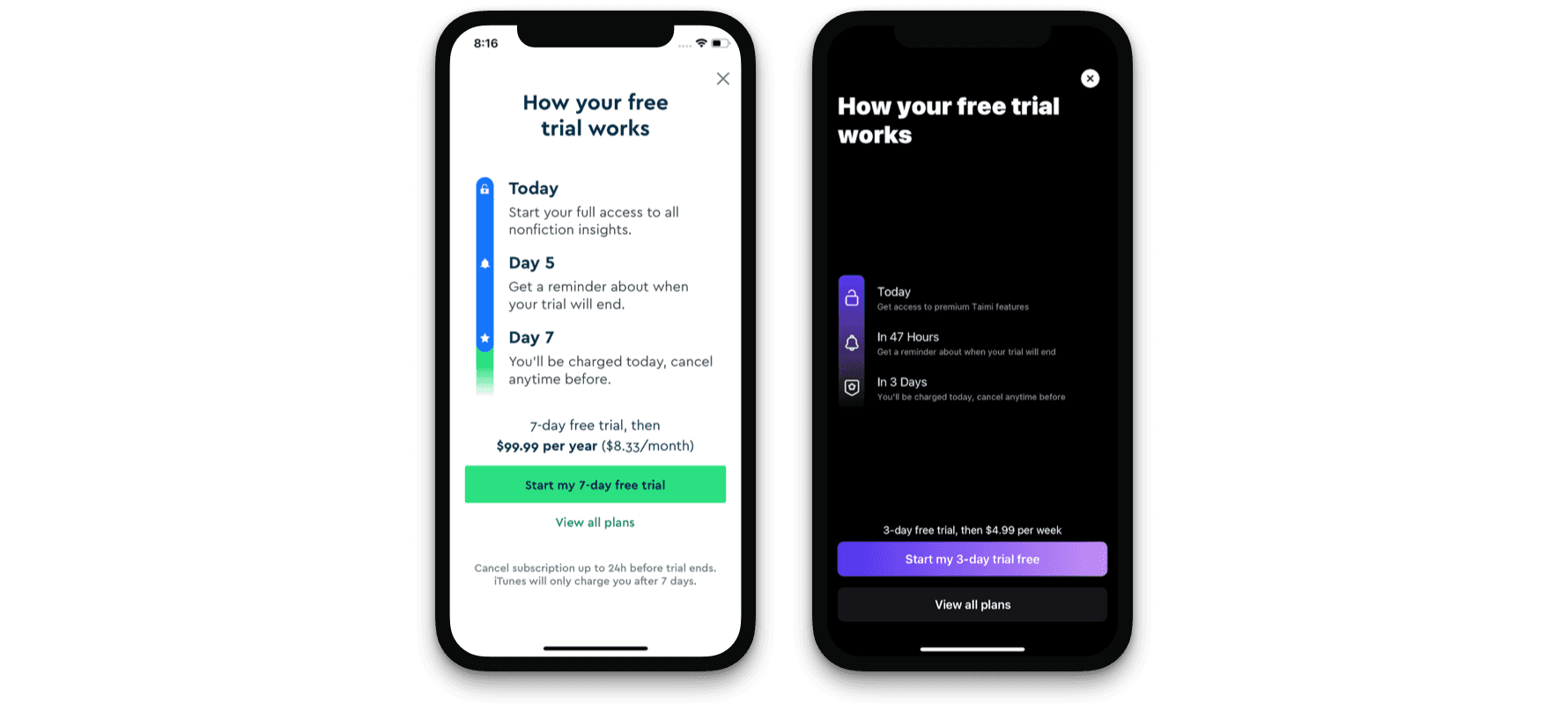
Great example of honest and transparent Paywalls from Blinkist and Taimi.
Paywall personalization
The more you know your user, the more tailored your offering can be. Use your onboarding data and visualize user goals or desired app benefits based on their segment.If you know your user wants to lose weight, make that info stand out. If they get on your paywall by taping locked feature x, that feature should be in the title. We know that it could be too much information to handle sometimes, so you can also use “pre-sell” screens, like GravityFit.
Conclusion
Designing the purchase screen might seem complicated, but we think that if you stick with simplicity and clarity, you can’t go wrong. In a fresher article, we've introduced more paywall examples and discussed Paywall UX best practices.Talk about your app’s benefits, show that it’s appreciated by other users, be transparent and personalize the experience. And of course most importantly, do experiment with it.If you need help to carry out your paywall A/B tests, Qonversion has an A/B testing tool that can let you try out paywall variations and prove or dispel your hypotheses prior to app releases.Join our webinar with Sam Mejlumian and plan out your 2025 A/B game.

Michael
CEO at Qonversion
Michael leads Qonversion with a vision to help mobile apps maximize their subscription revenue.