If you’re building a mobile app powered by subscriptions, your paywall isn’t just a design element - it’s a growth engine. And like any engine, it needs tuning. But where do you start? What makes a good A/B test? And how do you avoid wasting time on random ideas copied from competitors? We’ve seen that a systematic approach to paywall optimization unlocks significant revenue gains, without burning out your team.
Here are some common issues product teams face when they run A/B tests with no system in place:
- Your backlog looks like a “greatest hits” from competitor apps
- You’re testing features without knowing what actually drives user decisions
- Most A/B tests don’t move the needle on revenue
To help you turn paywalls into profit centers, Sergey Shpak, a Lead Product Manager with 4+ years of experience building mobile apps in Education, Health & Fitness, and Dating categories will walk you through the key levers of paywall optimization.
Levers of Paywall Optimization
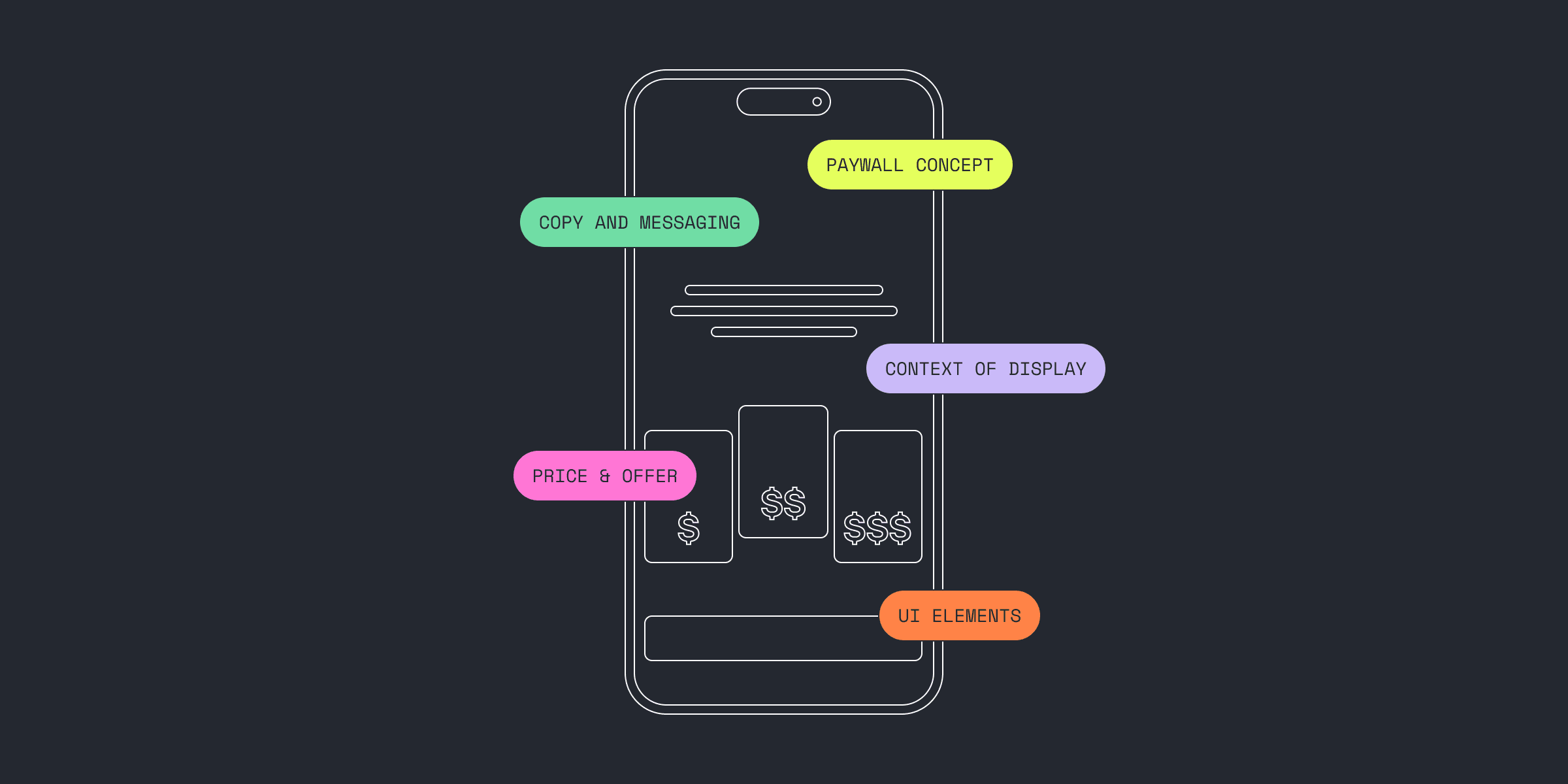
Before you start testing, it's crucial to understand what exactly you can tweak. Here are the core paywall elements you can experiment with.
- Subscription strategy (price, duration, trial offers)
- Paywall concept (overall layout and structure)
- UI elements (buttons, toggles, visual cues)
- Copy and messaging (headlines, CTAs, benefit statements)
- Display context (when and where users see the paywall)
Each element can drive improvements on its own, or become a multiplier when combined with others. The right approach depends on your specific hypothesis and the current stage of your app. For example, if you're testing multiple subscription durations, you may need to adjust the layout and add new messaging to support the offer.Pro tip: Avoid testing everything at once. Start lean, learn fast, then layer in complexity. And if you're using Qonversion, most of these changes can be deployed without coding or releasing a new app version, so you test more and ship faster.
1. Subscription Strategy
Getting the price and duration balance right is the foundation to a sustainable unit economy, and in some cases, it's one of the strongest drivers of LTV. Your subscription setup depends on your app category and acquisition channels. For example, in the utility domain, a weekly plan for $4.99 might dominate, while in Health & Fitness, a $39.99 annual plan is more common.
1.1 Subscription Pricing
Don’t shy away from experimenting with your pricing strategy. Price tests aren’t just about tweaking digits—they’re about discovering how much users value your app.
Some users will always resist paying. That’s a given. But pricing is a signal of value, and users will pay for quality if the perceived utility is strong enough.
Start with competitive research. If comparable apps are priced higher, that’s a green light to test a price increase. Go broader too — look at category-level pricing, but keep in mind that acquisition costs and user segments differ wildly from app to app, even in the same niche.When testing prices, focus on total revenue. A drop in conversion rates funnel (e.g., CR install → start trial → first purchase) doesn’t always mean a worse outcome. A price hike may reduce your conversion rates, but if ARPU (Average Revenue Per User) rises, you’re still winning.
Another reason why price tests are important is that you understand demand elasticity: if you raise your main annual plan by $10, how much does conversion drop? This insight helps you plan smarter tests and avoid chasing marginal wins.
Pro tip: Reevaluate pricing regularly. Economic conditions shift, user expectations evolve, and purchasing power fluctuates. And yes, always localize pricing by market.
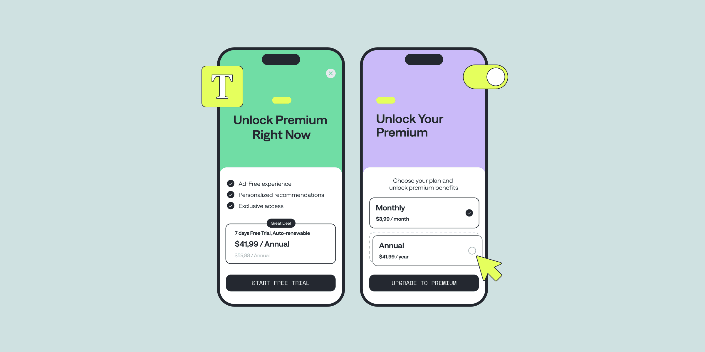
1.2 Number of Subscriptions on the Paywall
To boost conversions to your primary plan, consider placing an alternative plan alongside it. For instance, adding a more expensive 3-month plan next to the annual one can increase uptake of the yearly option by creating a sense of value. That 3-month offer? It’s not there to convert - it’s there to anchor.Psychologically, users compare options, not absolutes. A higher-priced alternative makes your primary plan look like a deal. This is called the decoy effect, and it works.But anchoring isn’t the only reason to show multiple options. Adding more plans can increase total conversion rates by catering to different user mindsets. Some users want flexibility. Others want commitment. And a few would rather pay once and never think about it again—enter the Lifetime plan.🧠 Behavioral tip: Lifetime plans often convert high-intent users right from onboarding. These users haven’t even experienced the value yet—they just trust what you’re offering. Let them buy.
You could write an entire post on how the number of options affects decision-making, but the takeaway is simple: more plans means more chances to monetize across segments, which means more revenue.
1.3 Subscription Duration
The best subscription duration strikes a balance between two forces: user behavior and recurring revenue mechanics. Nail that, and you’re on the path to sustainable LTV growth.
Some apps like Spotify or Flo lean on monthly plans because their users engage frequently and stick around. In these high-retention categories, lifetime plans are rare. Why? Because monthly subscriptions align better with long-term value delivery.
For apps with more episodic use or lower retention, shorter plans (like weekly) may outperform annual ones in total revenue — despite lower upfront value. The trick is calculating the real LTV from renewal patterns. A $4.99 weekly plan renewed 10 times beats a one-off $29.99 annual plan with zero renewals.Lack of historical data is the most common and the most important challenge in duration testing. If you’re trying a new monthly plan, you’ll need months to understand average renewals. If you lack internal benchmarks, look for public data, such as Sensor Tower reports.
1.4 Trial Periods or Intro Offers
Trials aren't mandatory but can significantly boost revenue, especially in content-heavy apps. Some users are ready to pay during the onboarding process without getting to use the app. Others want to try first, decide later, and free trials undoubtedly increase the number of users entering the subscription funnel. Here, your core metric splits into two: the conversions “install → start trial” and the conversions “trial→ first purchase.”
Trials also boost activation by offering premium feature access, increasing perceived value, and retention. There is no universal trial period duration, the choice depends on the category and domain area: from 3 days to a month or more. The main thing is that during this time, users have time to get a full experience of using the paid version of the product. I recommend trying the trial period if you have not done it before.
Trials also introduce a delay in evaluating paid user acquisition since you must wait for trial completion to assess conversion.
2. Paywall Design Concept
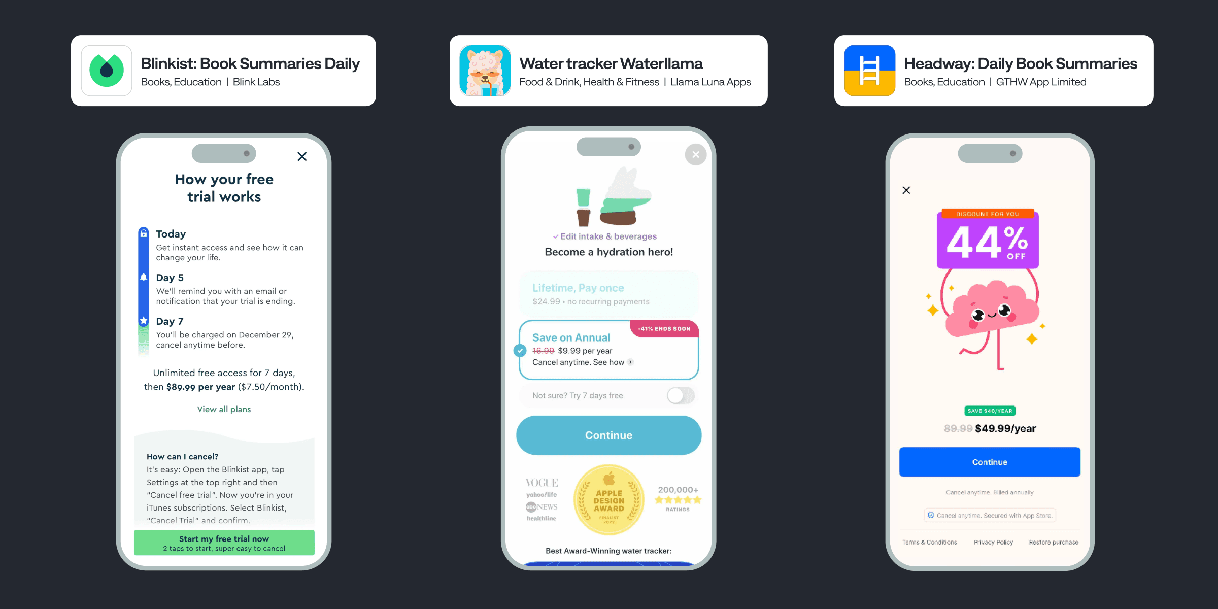
Another major lever of paywall optimization is the conceptual design. Apps with very different styles often have very similar paywalls. Here are some popular concepts that serve as templates:
- Blinkist-style: Classic screen with trial cancellation instructions
- Long Paywalls: Feature-heavy screen (e.g., Waterllama)
- Special Offers: Limited-time discounts (e.g., Headway)
- Illustration + Plans: Visuals above, three plans below (e.g., Muscle Booster)
If you're testing a complete overhaul of your paywall concept, keep in mind you're validating multiple product hypotheses at once. That’s not a bad thing—it’s often the smartest move when you’re just starting to build your monetization flow or when you want to validate bold, structural changes.In early stages, start by analyzing which paywall layouts are most common in your niche—tools like Mobbin can give you a solid head start. For more advanced teams looking to move fast without draining dev resources, use Qonversion’s no-code paywall builder to ship and test new concepts with minimal effort.
3. UI Design and Copywriting
Let’s say your paywall concept is set. Next lever: update visual or textual elements. Sometimes, a minor change here boosts conversion more than full-onboarding optimization. That’s exactly how one of our clients in Qonversion doubled their revenue.Copy ideas:
- Change button from "Subscribe" to "Continue"
- Add personalized messages to the headline
- Reframe USPs from listing features to addressing user needs
- Market yearly plan as "12-month access"
Design ideas:
- Animate the CTA button
- Add a toggle for trial inclusion
- Swap illustrations for more relevant use cases
- Reorganize screen blocks
- Add a "Save 90%" badge
There are infinite combinations of design, copy, and pricing. With paywall optimization, the sky is the limit. But here’s what matters most: every experiment isn’t just a shot at better metrics—it’s a chance to learn something new about your users.
That said, let’s also talk about dark patterns. Some developers resort to manipulative design tactics to boost conversions — ambiguous CTAs, hidden pricing, and misleading copy. While these approaches might drive short-term revenue spikes, they erode trust and risk app store penalties.
We don’t endorse that approach. But we get it: businesses need to sell. Still, it’s worth asking yourself at the strategic level — are you here for a quick win, or are you building something sustainable? App store guidelines are only getting stricter. And users today are savvier than ever about managing subscriptions.
>
Choose the path that scales: clarity, trust, and value. That’s how you build recurring revenue that lasts.
4. Context of Display
Display context is one of the most underrated levers in paywall optimization. In plain terms, it answers two critical questions:When does the user see the paywall—and what offer do they see?Throughout the Customer Journey Map (CJM), a user’s motivation shifts. During onboarding, it’s curiosity and expectations. But inside the app—say, when they tap on gated content—motivation becomes more specific. The user isn’t asking “What does premium include?” They’re asking, “Can I unlock this exact feature right now?”
Take dating apps, for instance. Tapping a locked profile might trigger a personalized paywall:
*“Want to see who liked you? Go Premium.”*
That’s contextual selling in action.
And here’s the kicker: you don’t always need a full paywall.
Apps like Duolingo often pitch micro-offers, like a $4.99 gem chest, without detailing every premium benefit. It's fast, frictionless, and works.
Don’t forget about seasonality
That same “Special Offer” screen? Dress it up for Black Friday, New Year, or any relevant holiday, and suddenly you’ve created urgency without changing the product.
To nail this, you need to map out your CJM and ask:
- What’s the user's intent at each step?
- Which premium feature would feel like a natural unlock?
- How can I tailor the paywall’s design or message to that moment?
Prioritization Through a Revenue Forecast Model
To launch a structured and scalable A/B testing system, skip the frameworks — at least at first.
Popular methods like RICE (Reach, Impact, Confidence, Effort) and ICE (Impact, Confidence, Ease) are useful for scoring ideas quickly. But they’re built on assumptions, and they treat all metrics equally. That can lead to experiments that are “easy” or “popular” but not necessarily the most profitable.Instead, start with a predictive revenue model. Think of it as a monetization calculator. Ideally, it’s a Google Sheet that visualizes your full funnel:Installs → Conversion to Paid (after store fees) → Subscription Retention (renewal rate) → ARPU
This model becomes your decision-making compass. Use it to simulate test outcomes:
- What happens to revenue if you raise the price 10%, even if conversion drops?
- What’s the gain from a 5% bump in conversion via a paywall redesign?
- Which experiment yields more upside given equal development time?
This shifts prioritization from instinct to impact, from “what feels right” to “what pays off.”
On top of that, the model helps predict subscription cannibalization. Say you're adding a second plan and expect it to reduce conversions on the first. That might sound bad— until you realize total LTV could increase. That’s a trade worth making.
Plus, you’ll gain clarity on what’s driving your revenue. You might find, for example, that a mid-tier monthly plan generates more value over time than your flashy annual offer.
Once your backlog fills up, you can still layer RICE or ICE on top but always anchor prioritization in revenue potential, not guesswork.
Pro Tip: Our analytics tools help you track actual ARPU, renewals, and churn so your forecast model stays grounded in reality, not theory.
Wrapping Up: A/B Testing System Over Hacks
There’s no universal blueprint for paywall success. Every app is different. Every audience is different. What is universal? The process.
It all starts with two questions:
- What levers can we influence?
- Where do we start experimenting?
Let’s recap the key levers of paywall optimization:
- Subscriptions: What plans do you offer, at what price, and for how long?
- Paywall Concept: How is the screen structured and visually framed?
- Design & Copy: What can be tweaked to improve clarity and conversion?
- Display Context: When and where do you show the paywall for max impact?
You’ll use different levers at different product stages.
- Just launched? Focus on pricing and core layout—get the unit economics right.
- Scaling? Dive deeper into behavioral triggers, creative tests, and contextual offers.
Speed is your growth multiplier.
The faster you test, the faster you learn, and the faster your monetization improves. Prioritize ruthlessly—not just with RICE or ICE, but with financial modeling that shows which test will move revenue.
Final Tips for Running Lean, High-Velocity Tests
- Loop in your team: Designers can spark fresh visuals; developers can unblock fast delivery.
- Automate where possible: Move the copy into configs. Reduce release cycles. Make testing part of your delivery DNA. We fully support this with Qonversion’s remote configs so you don’t release a new app version with every change.
- Track success rates: If your tests keep flopping, hit pause. Review your backlog, refine your hypotheses, and resume when ready. Again, this is accessible with Qonversion.
- Always test: Take it as a rule and let there be one live experiment. Keep iterating and keep growing.
Good luck—and may your ARPU scale faster than the next TikTok trend!

Sergey Shpak
Lead Product Manager
Sergey has 4+ years of experience building mobile apps in Education, Health & Fitness, and Dating categories.