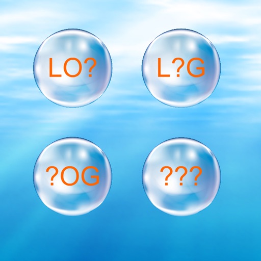
Magnetic letters
View in App StoreGrow your in-app revenue
while we take care of your subscription management.
Mobile
SDK by Qonversion.
Price Intelligence based on:
213,534
apps aggregated
8,172,290
in-app prices defined
89
main categories
In-App Purchase Price (Subscription or Non-Recurring)
vs. average for the Entertainment category, $, by region
Build, analyze, and grow in-app subscriptions
with the most powerful mobile SDK for subscriptions
User Reviews for Magnetic letters
Not the best app for letters
The font is very difficult to read. It would be a lot better if it wasn't shaded, like some sort of word art.
Skip it
The letters are too close together on the bottom of the screen and arranged in a skewed manner. This makes it hard for kids to be accurate. Would be better if it had text to speech capabilities.
Description
Move letters of the alphabet around the screen with multi-touch. You have an infinite number of alphabet fridge magnets, drag them onto the screen and arrange them using all of your fingers, move up to 10 letters around at the same time. You can hear the name of the letter pronounced as you drag it.
More By This Developer


You May Also Like


POWER SUBSCRIPTION REVENUE GROWTH